I couldn’t resist a good home tour so I decided to close the year with this one! I’ve always loved interior designer Rod Lascano’s projects, whose work is quite magical when dealing with small condo units and its available space. Just look at his former project, a 17sqm unit, which has gone practically viral over the past few years.
As seen in that 17 sqm unit, Rod’s projects for bachelor pads (gosh, do they still call them that? Did I just date myself??) don’t fall into the usual man-cave cliché of black leather sofa, giant entertainment system, and the clutter of assorted dude accoutrements.
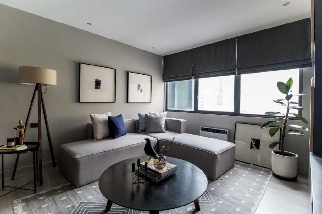
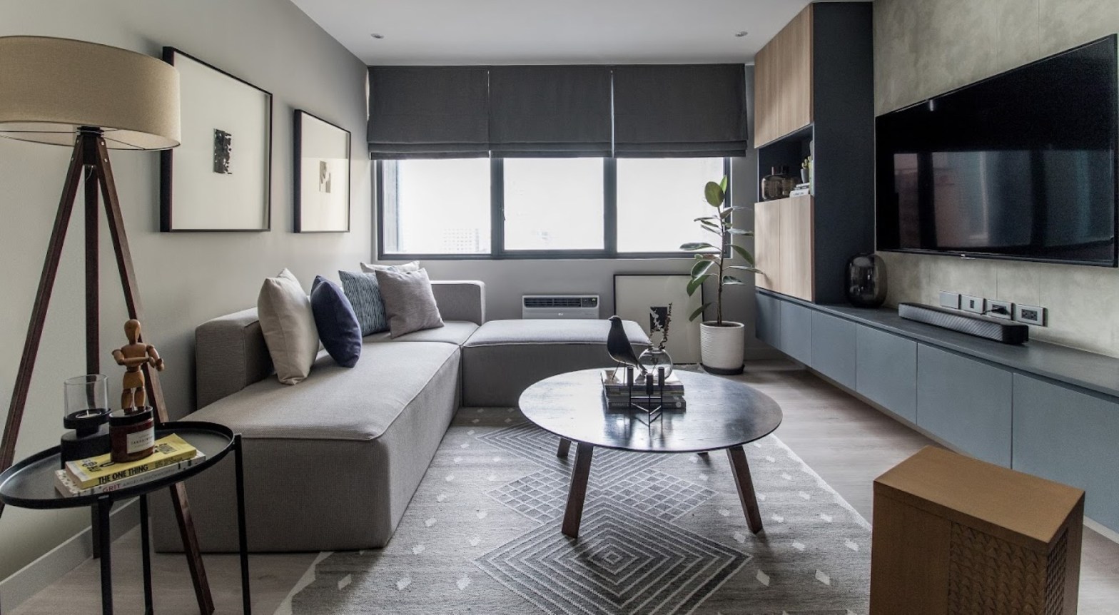
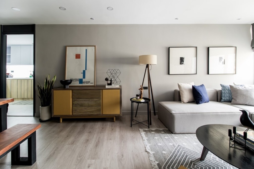
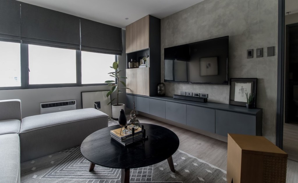
Take for example, the interiors of this 60sqm unit, which Rod worked on with design and construction outfit William Brothers Manila. The clean and cool-looking heather gray walls offset the industrial-style feel of the finish of the accent walls. The furniture pieces are tailored and sophisticated, and are versatile enough to be guy-friendly and gender-neutral at the same time, if a couple eventually decided to live in it. And wood pieces in walnut finish add just the right touch of warmth to the urban space.
“I guess we were going for something related but more mature or leveled-up,” the interior designer explains of this direction for his client. “He wanted a space to go home to that has a good balance of warm and cool tones. His original condo unit was more of a bachelor’s pad, for this unit our main goal was to make it into a long-term home.”

“We were going for something simple and modern, but still have that punch that would make the user feel that he’s in a well-designed and planned space,” says Rod of the overall style. “We wanted something more adult that both a yuppie or an older generation would appreciate or can live in.”
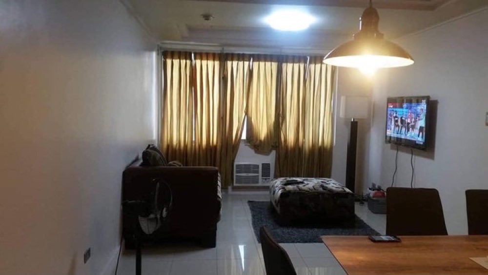
Rod showed me the “before” photos of the unit (above photo), and it was such a shocker! The living room was dark and cramped, even if it wasn’t fitted with any built-ins, and had distracting beams that seemed to close in on the space. The airiness was masked by heavy drapes, and save for the kitchen, it was devoid of any sort of storage area.
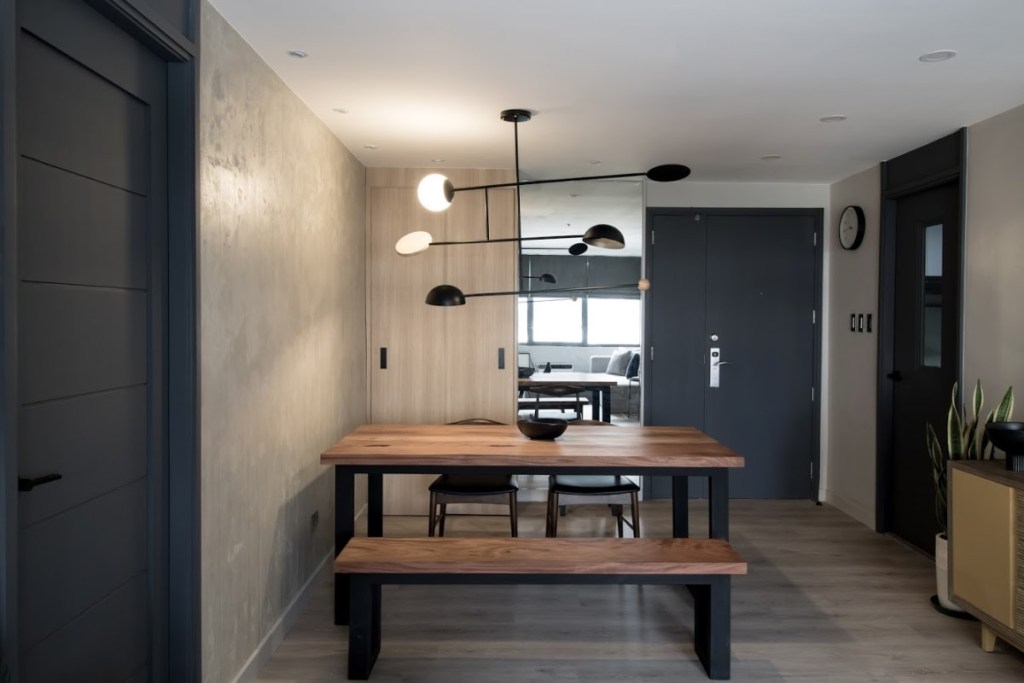
The interior designer revealed that, in spite of the dramatic renovation, everything was done on a tight budget. “We also wanted to reuse the shell of the space, so whatever we can save for example, the carcass of the hallway cabinets and the kitchen cabinets we reused. We just re-laminated them.”
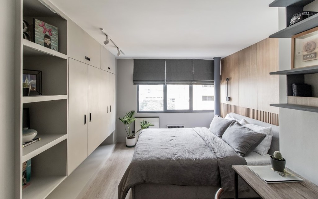
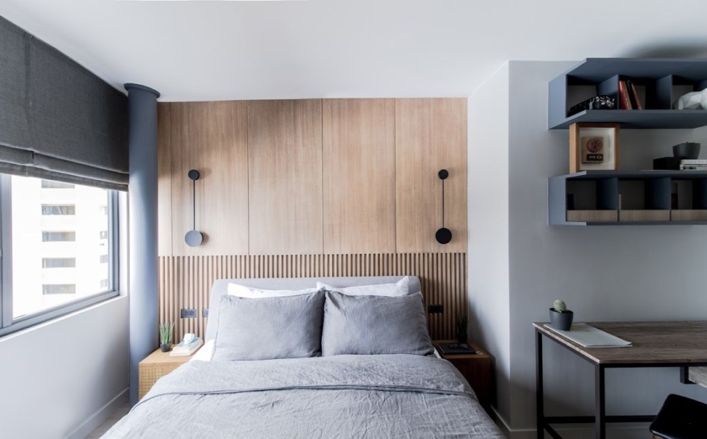
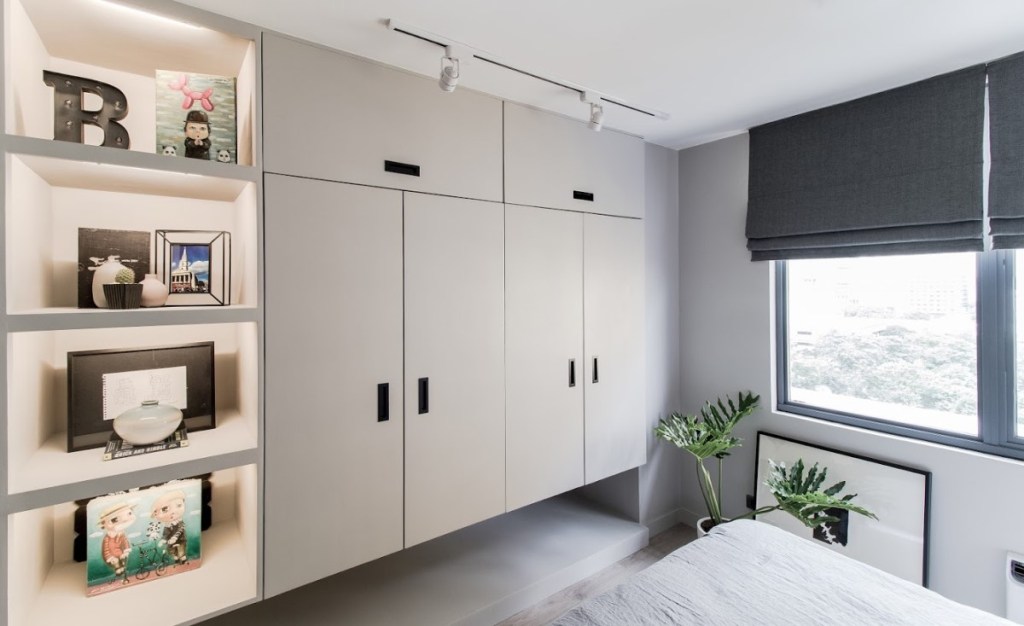
Even though this condo unit was considerably larger than Rod’s old 17sqm and 28sqm projects, storage was still given absolute importance, most especially in the bedroom. “Actually, the wardrobe of the bedroom is originally an awkward niche/corner in the room. To make it look cleaner, I made use of it and covered it with a cabinet. Usually, full height (floor-to-ceiling) cabinet doors look heavy or chunky, so to make it feel more open, I made the leftmost shelves and the bottom also open storage for bags, shoes, etcetera.”
Serendipitously enough, this mostly gray (with a slight touch of yellow!) unit was presented on the week that Pantone launched its colors of the year: Illuminating (a vibrant yellow hue) and Ultimate Gray. I asked Rod, Mr. Gray himself, if he was thrilled about it.
“The 2021 Pantone colors are very familiar to me. I was actually excited to find out that it was gray and yellow. For me gray is diverse and flexible as an achromatic color,” Rod gushes. “Gray can be warmer or cooler depending on the feel and aesthetic of the space. It’s an easy color I think that you can match to either another neutral or a very bright accent color…for me the gray color gives you a depth and feel that isn’t too overbearing.”
Photography by Paulo Valenzuela, courtesy of William Brothers Manila. Contact Rod Lascano on Instagram @rodlascano

One thought on “Home Tour: Shades of Gray in a 60sqm Unit”